The document I chose for my redesign project is an article in a 2012 edition of The Montecito Journal. As an English major, intern for three different magazines, and partially-OCD person, this publication really bothers me. I personally love color and eye-catching elements, and this journal has none of that. The one picture, off to the right and way too small, is black and white and says nothing about the huge blocks of text in the article. Speaking of text, there is way too much text to be any amount of interesting and when people are skimming, they simply will not read any of that mess of words. There is also too much of a contrast between white blank space and text crammed together. In accordance to the CARP standards, I have the following criticisms:
CONTRAST:
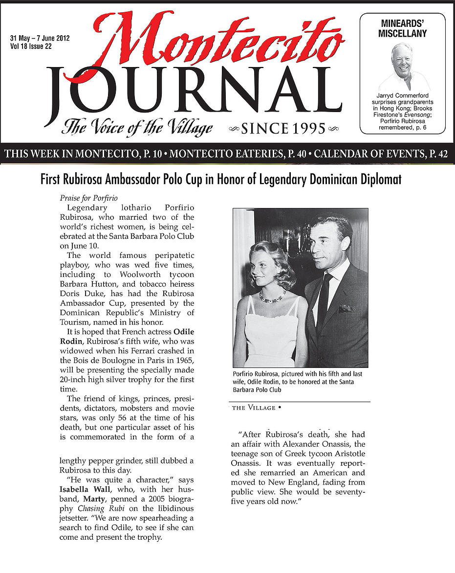
In terms of contrast, the article has no color coordination and is very boring. The white space contrasts too much with the text, and there is too much space that isn’t used correctly. The pictures come out a bit blurry/faded and I personally thought this edition was from the ‘80s but it is actually only three years old. The only redeeming quality is that the bolded proper nouns do bring contrast to the information and help the reader figure out what the story is about.
ALIGNMENT:
The columns are too wide and although nothing looks like it was placed there randomly, the document just looks very boring and a waste of paper. I would pick a bigger, brighter picture and align the text in three wide columns below it or just three or four wide paragraphs on top of each other. Also the image does not show a visual connection to the text besides being placed close to each other. They do not work with each other.
REPETITION:
Since this is only one article, there is not much to be repeated but the pros with the journal itself is that the publishers use the same heading each issue which is good, recognizable repetition and makes sense. I still don’t like the black line separating the article from the heading– it is too thick and breaks up the whole document.
PROXIMITY:
The caption under the photo explaining who the two people are is good for the proximity element, but besides that, the layout is terrible. As the recommendations say, people remember visuals better than bullet points. The information in this article is listed in lots of small paragraphs and although that is easier to read, the picture takes away from the positive writing. There are also awkward spaces between the text blurbs that seem unnecessary. I can’t wait to redesign this so it looks eye-catching and interesting.
